Volume went up and revenue went down. Here is the pandas to explain it
A price, volume, and mix decomposition in about 30 lines, with a chart at the end.

Trading volume rose 5.4% last month. Fee revenue fell 4.0%.
Trading volume
$3.31bn
5.4% vs August
Blended rate
5.69bps
0.56 bps vs August
Fee revenue
$1,885k
4.0% vs August
Change in fee revenue from August to September, split by cause. Synthetic data; this is the answer the article builds.
- Added revenue
- Cost revenue
- Net
View as table
| Effect | Amount |
|---|---|
| Volume | +$106k |
| Mix | -$48k |
| Rate | -$136k |
| Total change | -$79k |
If you work on revenue analytics in any business that earns a small percentage of a large flow, you have been in the meeting that follows. Someone says the big clients were busy. Someone else says pricing must have slipped. A third person suspects the data. Everyone has a theory and no one has a number.
There is a standard way to replace the theories with arithmetic. Finance teams call it price, volume, and mix analysis. It splits a change in revenue into three parts that add up exactly to the total, and it takes very little pandas. This article walks through it on a synthetic dataset, so you can run every line.
The setup
The example is a brokerage-style business with three client segments that pay very different fees:
| Segment | Share of clients | Fee |
|---|---|---|
| Retail | 70% | 35 bps |
| Professional | 25% | 12 bps |
| Institutional | 5% | 4 bps |
Volumes are lognormal, so a handful of clients account for most of the flow, which is how these businesses look in practice. I planted three changes in September: retail volume drops, institutional volume jumps, and the professional and institutional segments each get a small fee cut. Planting the answer matters. It lets you check that the method finds what you put there.
import numpy as np
import pandas as pd

rng = np.random.default_rng(7)

segments = {            # share of clients, typical monthly volume, fee in bps
    "Retail":        (0.70, 2e5,  35),
    "Professional":  (0.25, 4e6,  12),
    "Institutional": (0.05, 9e7,   4),
}
growth    = {"Retail": 0.92, "Professional": 1.05, "Institutional": 1.45}
fee_shift = {"Retail": 0.0,  "Professional": -0.5, "Institutional": -0.4}

rows = []
for seg, (share, typical, bps) in segments.items():
    for cid in range(int(400 * share)):
        for month in ["2026-08", "2026-09"]:
            sept = month == "2026-09"
            vol = rng.lognormal(np.log(typical), 0.9) * (growth[seg] if sept else 1.0)
            fee = bps + (fee_shift[seg] if sept else 0.0)
            rows.append((f"{seg[:3]}-{cid:03d}", seg, month, vol, fee))

df = pd.DataFrame(rows, columns=["client", "segment", "month", "volume", "fee_bps"])
df["revenue"] = df["volume"] * df["fee_bps"] / 1e4
Run it and you get the headline numbers at the top of this article. Volume is up, revenue is down, and the blended rate fell by about half a basis point. The blended rate alone can’t tell you why. It falls when you cut prices, and it falls just the same when a low-fee client has a busy month.
The idea
Revenue is volume times rate, summed over segments. Write total volume as V, each segment’s share of that volume as s, each segment’s rate as r, and the blended rate as b, the share-weighted average of the segment rates. Revenue is then V × b, and the change from period 0 to period 1 splits into three effects:
- Volume effect:
(V1 - V0) * b0. What you would have gained if only the total moved and everything else stayed as it was. - Mix effect:
V1 * sum((s1 - s0) * (r0 - b0)). What you gained or lost because volume shifted between segments that earn different rates. - Rate effect:
V1 * sum(s1 * (r1 - r0)). What you gained or lost because rates changed inside segments.
Add them up and the terms cancel to V1 * b1 - V0 * b0, which is the revenue change. There is no residual to explain away.
One detail in the mix term is worth a sentence. Measuring each segment’s rate against the blended rate, (r0 - b0), gives the same total as using r0 alone, because the share changes sum to zero. It makes the per-segment numbers readable, though. Gaining share in a segment that earns less than average comes out negative, which is what your intuition expects.
The decomposition
Aggregate to one row per segment per month, compute share and rate, and the rest is a few lines.
seg = (df.groupby(["month", "segment"], as_index=False)
         .agg(volume=("volume", "sum"), revenue=("revenue", "sum")))
seg["rate"]  = seg["revenue"] / seg["volume"]
seg["share"] = seg["volume"] / seg.groupby("month")["volume"].transform("sum")

p0 = seg[seg["month"] == "2026-08"].set_index("segment")
p1 = seg[seg["month"] == "2026-09"].set_index("segment")

V0, V1 = p0["volume"].sum(), p1["volume"].sum()
R0, R1 = p0["revenue"].sum(), p1["revenue"].sum()
b0 = R0 / V0

volume_effect = (V1 - V0) * b0
mix_by_seg    = V1 * (p1["share"] - p0["share"]) * (p0["rate"] - b0)
rate_by_seg   = V1 * p1["share"] * (p1["rate"] - p0["rate"])

assert np.isclose(volume_effect + mix_by_seg.sum() + rate_by_seg.sum(), R1 - R0)
Keep the assert. It is the line that makes other people trust the method, and it will catch you the day someone changes a join upstream.
The result
The three effects are the chart at the top of this article: volume added $106k, mix cost $48k, and rate cost $136k, for a net change of -$79k. The by-segment terms show where each one came from.
Mix and rate effects by client segment. The institutional fee cut is the largest single item.
- Added revenue
- Cost revenue
View as table
| Segment | Mix | Rate |
|---|---|---|
| Retail | -$46k | $0 |
| Professional | +$1k | -$32k |
| Institutional | -$3k | -$105k |
Now the meeting has something to work with. The extra volume was worth $106k at August’s blended rate. Retail, the highest-fee segment, lost share, and that cost $46k. The fee cuts cost $136k, most of it institutional, because a small cut applied to the largest volume is the biggest number on the page.
All three planted changes came back out, each in the right place. The headline that volume grew 5% was true and beside the point.
The chart
One bar per effect is enough. Bars that added revenue grow right from zero, bars that cost revenue grow left, and the net change sits underneath.
import matplotlib.pyplot as plt

plt.rcParams["font.family"] = ["Helvetica Neue", "Arial", "sans-serif"]

mix_effect, rate_effect = mix_by_seg.sum(), rate_by_seg.sum()
effects = {"Volume": volume_effect, "Mix": mix_effect, "Rate": rate_effect, "Net change": R1 - R0}
BLUE, RED, GRAY, INK = "#2a78d6", "#e34948", "#8b857b", "#1d1b18"

fig, ax = plt.subplots(figsize=(8, 2.7))
names = list(effects)[::-1]                       # barh draws bottom-up
values = [effects[n] for n in names]
colors = [GRAY if n == "Net change" else (BLUE if v >= 0 else RED) for n, v in zip(names, values)]
ax.barh(names, values, color=colors, height=0.52)

pad = max(abs(v) for v in values) * 0.03
for y, v in enumerate(values):                    # value at the end of each bar
    ax.text(v + (pad if v >= 0 else -pad), y, f"{v/1e3:+,.0f}k",
            va="center", ha="left" if v >= 0 else "right", fontsize=11, color=INK)

ax.axvline(0, color=INK, linewidth=1)
ax.set_xlim(min(values) * 1.28, max(values) * 1.28)
ax.xaxis.set_visible(False)
ax.tick_params(axis="y", length=0, labelsize=11, labelcolor=INK)
for side in ax.spines.values():
    side.set_visible(False)
fig.tight_layout()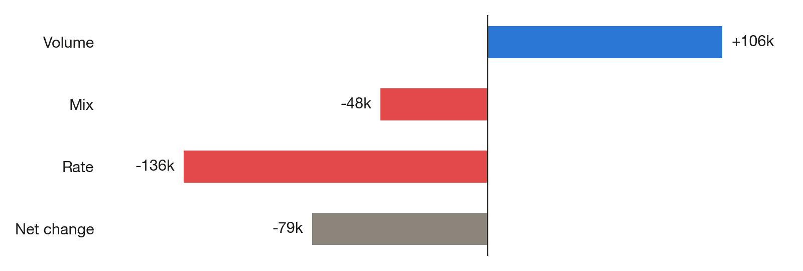
Four things to decide before you ship it
The order is a choice. This version values the volume change at the old blended rate and the rate change at the new shares. Other orderings move a small amount between the effects. None is more correct. Pick one, write it down, and use the same one every month, or your trend will reflect your method changing rather than the business.
The level of aggregation changes the answer. Decompose by segment, and a pricing change for one client shows up as rate. Decompose by client, and a client who trades more shows up as mix. Both are right. They answer different questions, so say which one you ran.
New and lost clients have no rate in one of the periods. At client level you have to decide what to do with them. I treat them as mix, a share moving to or from zero, and report them on their own line so they don’t hide inside the total.
Rate here means revenue divided by volume. Anything that changes revenue without changing volume, such as rebates, credits, and minimum fees, lands in the rate effect. If those are large, split them out before you decompose.
What to take away
A revenue change is explained when you can say it in one sentence: revenue moved by X, of which volume was A, mix was B, and rate was C. If the write-up can’t be put in that form, the analysis isn’t finished. The code to get there is short enough that there is no reason to guess.